What Are Psychedelic Colors? Definition, Origins, and Visual Impact
Psychedelic colors are ultra-saturated, high-contrast color palettes designed to mimic altered states of perception, often evoking visual intensity, motion, and sensory depth. In this article, you’ll explore their historical roots in the 1960s counter-culture, discover the fascinating neuroscience behind their vivid visual impact, learn practical tips for applying psychedelic palettes, and see inspiring real-world examples of psychedelic artwork from TrippyVisual.

Psychedelic Colors Images
A Concise Definition & Core Traits
Psychedelic colors refer to palettes characterized by extreme vibrancy, saturation, and visual intensity, often associated with hallucinogenic experiences and sensory exploration. The hallmark features of these palettes include fluorescent neons, which glow vividly and command attention; vibrating complements, such as magenta (#FF00FF) paired with electric lime (#39FF14), that create visual tension and perceived movement; liquid gradients, where colors smoothly blend and shift, producing fluid, mesmerizing effects; and deep-void blacks, intense dark backdrops that amplify color luminosity and make neon tones appear self-illuminating.
When employed effectively, these colors seem to pulsate, swirl, or glow, often simulating altered states of perception even without chemical enhancement. Psychedelic palettes deliberately defy typical visual expectations, resulting in images or visuals that feel immersive and almost three-dimensional.
To understand how these intense color effects entered mainstream culture, it helps to revisit their vivid origins in the creative explosion of the 1960s.
Historical Roots: 1960s Counter-Culture to Today’s Digital Art
Psychedelic colors emerged prominently during the cultural revolution of the 1960s, epitomized by vibrant Day-Glo® inks that lit up concert posters, album covers, and counterculture artwork. Perhaps the most iconic example from this era is Milton Glaser’s 1967 poster of musician Bob Dylan, depicting Dylan’s silhouette filled with a dynamic, swirling rainbow of intensely saturated hues. This piece became symbolic of psychedelic aesthetics, visually representing the energy and spiritual exploration defining the era.
The vividness of these colors was enhanced by black-light chemistry, where specialized fluorescent pigments absorbed invisible ultraviolet (UV) light and emitted visible wavelengths, creating a luminous, almost magical glow in dimly-lit environments like nightclubs and concert halls. This striking visual experience amplified the psychedelic culture’s interest in sensory expansion and altered states of consciousness.
In the decades following, psychedelic palettes evolved alongside technological advances, resurfacing powerfully in digital forms. The arrival of fractal-generated screensavers in the 1980s and 1990s, the DeepDream algorithm in the 2010s, and today’s AI-generated (GAN) visuals and high-resolution 4K YouTube animations have expanded the possibilities and accessibility of psychedelic color art, bringing vivid, immersive experiences directly to personal screens.
Museums such as the Smithsonian Institution have archived key pieces from the psychedelic era, recognizing their cultural significance and lasting impact on visual art.
History of Psychedelic Art
The Science: Why Psychedelic Colors Feel “Alive”
The intense visual qualities of psychedelic colors aren’t just artistic choices—they reflect how the human brain processes color under altered states of consciousness. Studies on substances like LSD and psilocybin have consistently shown a phenomenon known as visual intensification, where users report heightened brightness, deeper saturation, and sharper edges in their visual field.
According to a 2022 study published in NeuroImage, psychedelic compounds reduce the brain’s top-down filtering mechanisms, allowing more raw sensory input to reach the visual cortex. This increase in unfiltered data is thought to enhance contrast and color perception, making ordinary hues appear radiant and immersive. Under the influence of psychedelics, simple colors may seem to glow or move, even when static—a phenomenon driven by increased neural entropy and spontaneous pattern recognition.
Another fascinating effect reported by some users is temporary synesthesia, where senses blend—such as “hearing” colors or “tasting” shapes. While this experience varies widely, it supports the idea that psychedelic colors are more than visual—they are deeply tied to multi-sensory perception.
The intensity of these effects is also dose-dependent. At micro-dose levels, most individuals experience little to no color distortion. However, at moderate to high doses, users often describe colors as breathing, morphing, or appearing in shades they’ve never seen before.
These findings help explain why psychedelic color palettes resonate so strongly—they mirror, and often attempt to simulate, genuine perceptual shifts that occur in altered states of consciousness.
Hallmark Color Schemes & Practical Tips for Creators
Psychedelic color palettes may appear chaotic at first glance, but they often follow distinct compositional models designed to amplify visual intensity and evoke emotional response. Here are four commonly used psychedelic color schemes:
- Neon Plus Black: This scheme pairs high-luminance neons (like #FF00FF or #00FFFF) with deep blacks (#000000) to create glowing effects. The contrast tricks the eye into perceiving colors as self-illuminated—a technique often seen in rave flyers and 4K concert visuals.
- Complementary Vibration: Placing opposing colors (e.g., magenta vs. lime, red vs. cyan) side by side causes a perceptual “buzz” due to retinal rivalry. This effect is popular in VJ loops and LED wall content, where motion is suggested even in static frames.
- Spectrum Cycles: Cycling gradually through the full color spectrum (ROYGBIV) mimics the evolving visuals often described in psychedelic experiences. It’s commonly used in meditative visualizers and trippy screensavers.
- Liquid Gradients: Soft, slow transitions between hues create a melting or breathing effect. This technique works well in ambient content meant for relaxation or introspection.
For artists, tools like Adobe Color or Coolors.co can help build psychedelic-friendly palettes. Try using a triadic color scheme for balance—selecting three hues evenly spaced on the color wheel. For example, pairing #39FF14 (neon green), #FF00FF (hot magenta), and #00FFFF (electric cyan) offers bold harmony.
Lastly, consider accessibility: simulate color-blindness using tools like Coblis to ensure your visuals remain engaging and readable for a broader audience. Adjust contrast or add texture if necessary to improve clarity without sacrificing impact.
Hallmark Color Schemes
Stand-Out Psychedelic Artworks
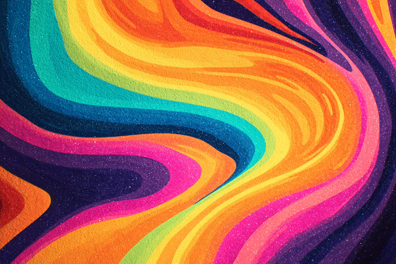
To see psychedelic colors in action, we’ve selected three standout pieces from TrippyVisual that showcase the core principles of psychedelic palettes—vibrancy, contrast, motion, and emotional immersion. Each artwork reflects a distinct color scheme discussed earlier and demonstrates how visual design can simulate altered perception in digital form.
Color Signature: Electric teal and orange on a black void
This piece is a textbook example of complementary vibration. The opposing colors create dynamic tension, enhanced by slowly shifting kaleidoscopic gradients. The black background intensifies the saturation, making the colors appear as if they’re radiating light. The visual flow feels meditative yet expansive—evoking the sense of “color-space expansion” often described in psychedelic states.

Surreal Psychedelic Art
Color Signature: Glacial blues transitioning into ultraviolet bursts
A perfect representation of the spectrum cycle, this loop uses gradual, breathing transitions through cool hues that crescendo into bright neons. The pacing mirrors a psychedelic “rise”—calm beginnings building toward euphoric intensity. Its balance between visual calm and vivid pulses aligns with the 1960s tradition of fluorescent art, now reborn through high-resolution digital tools.

Celestial visuals for LSD
Closing Paragraph
Psychedelic colors—ultra-saturated, high-contrast palettes that evoke altered perception—are more than visual effects; they reflect deep intersections between art, culture, and neuroscience. From 1960s black-light posters to modern digital loops, their impact continues to evolve. To experience these concepts firsthand, explore more immersive visuals in our Psychedelic Art Gallery.